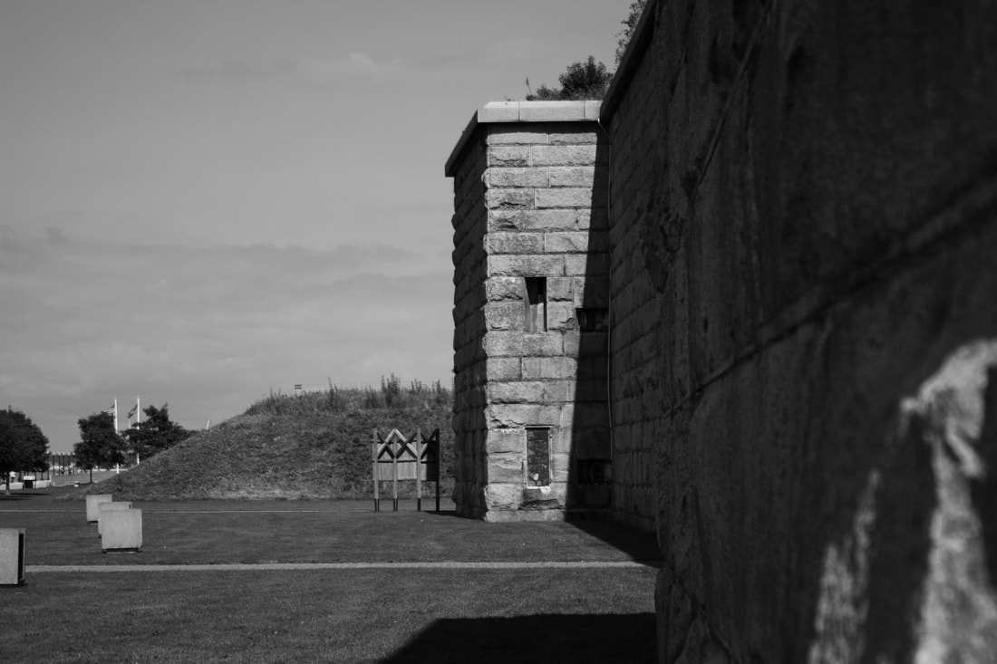
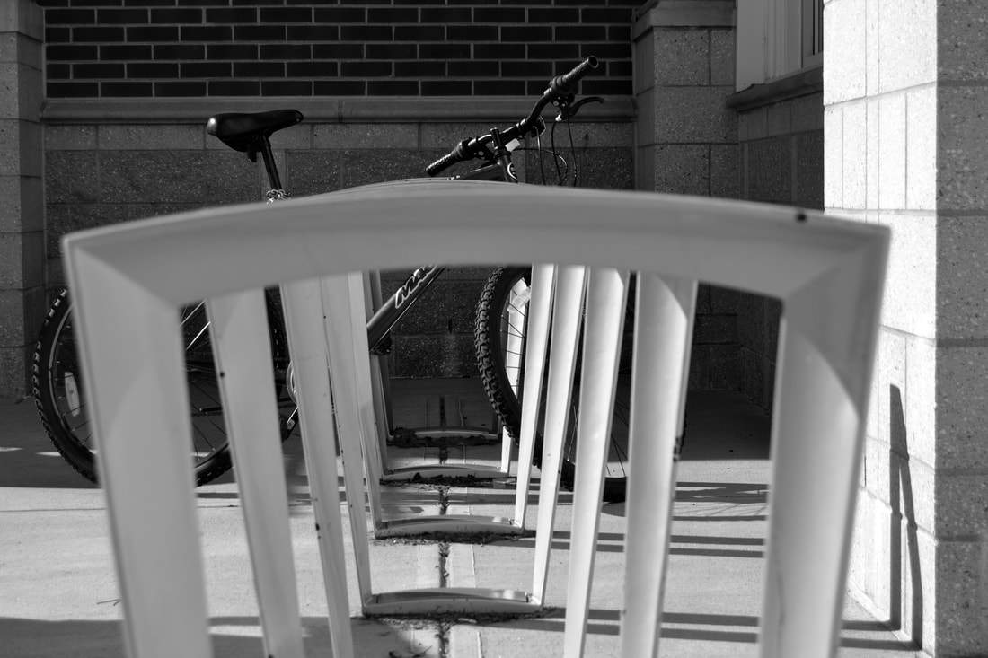
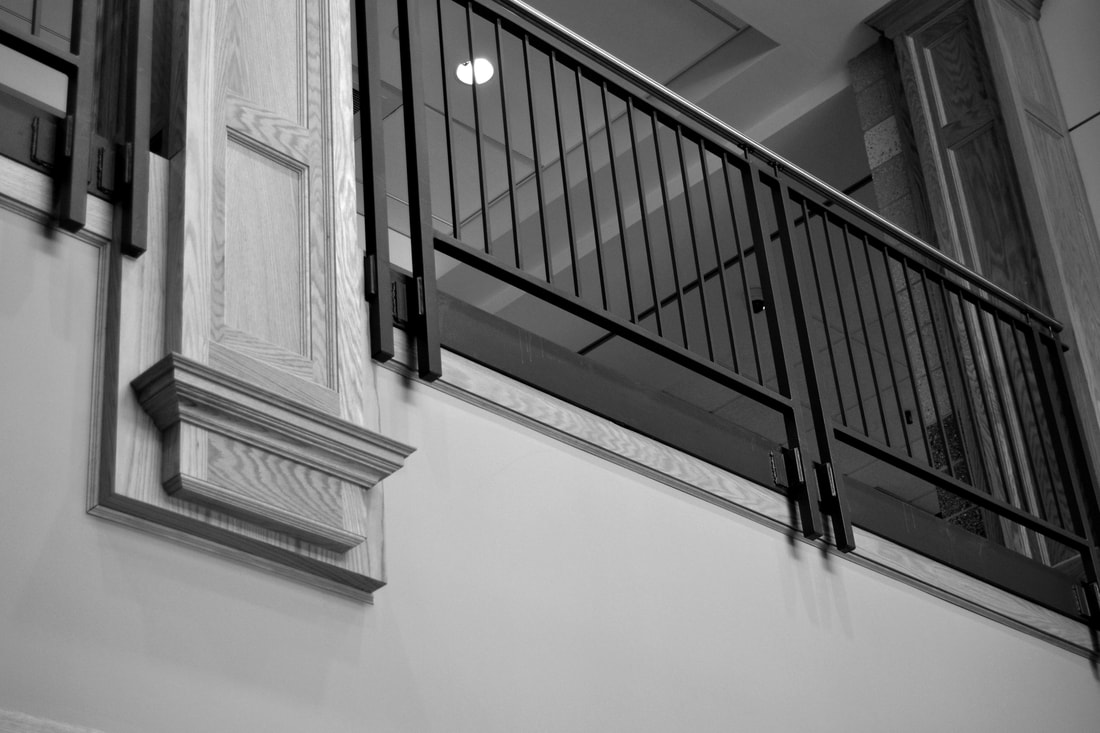
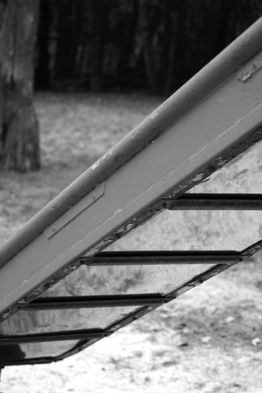
Line and Shape
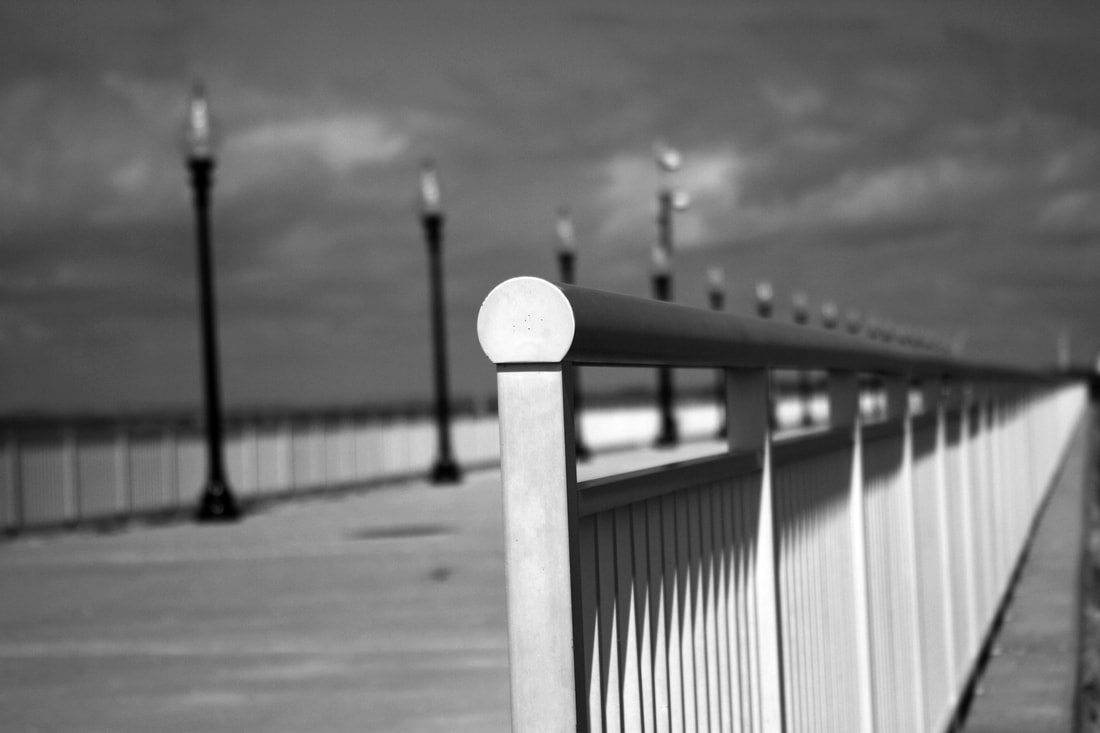
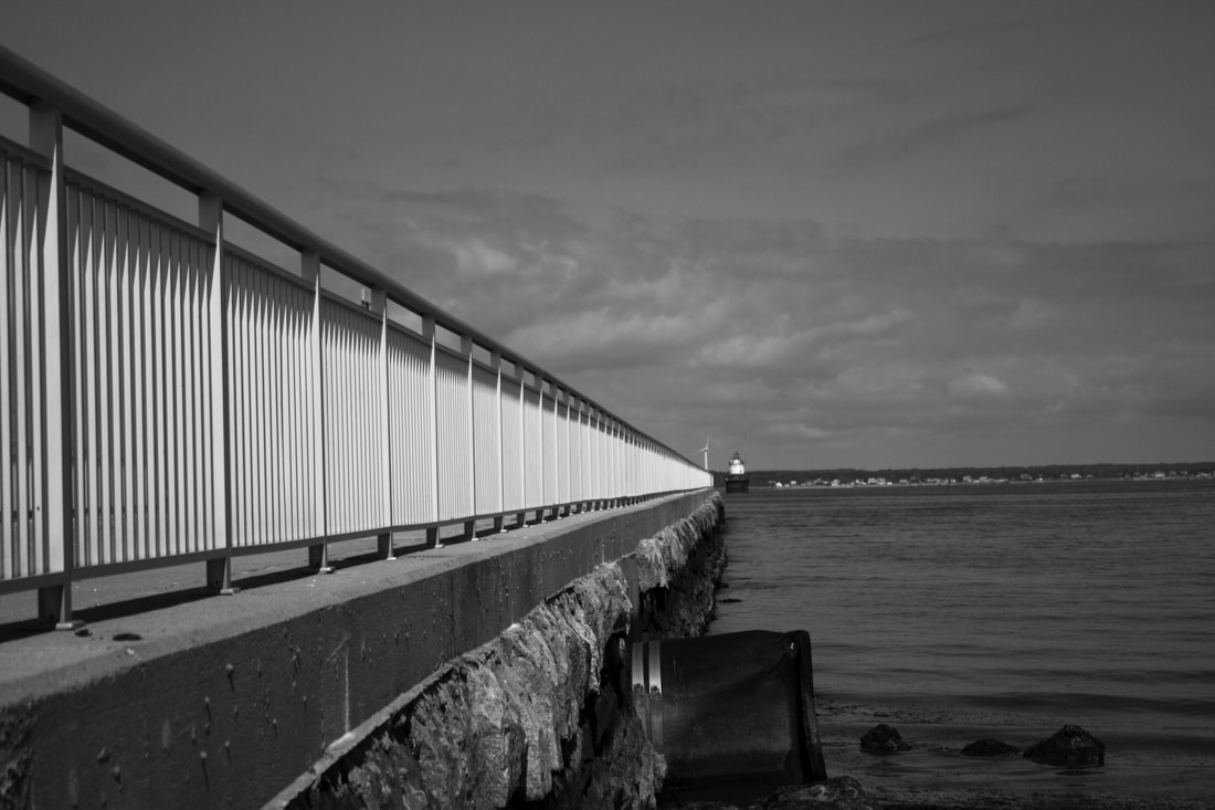
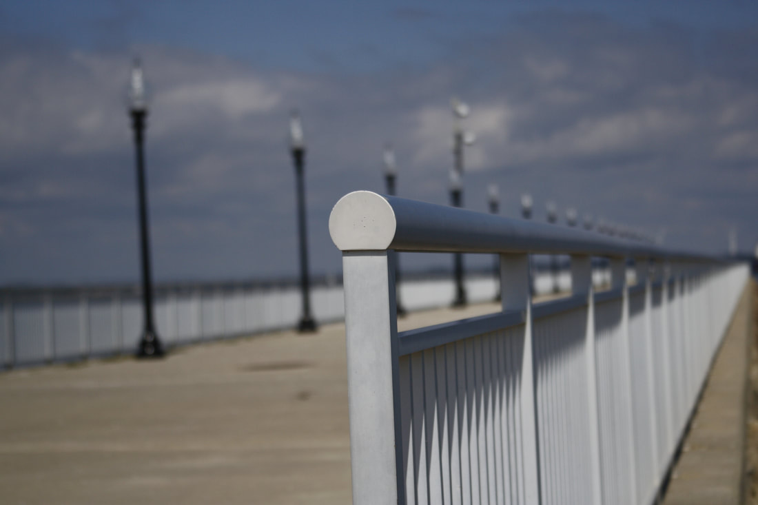
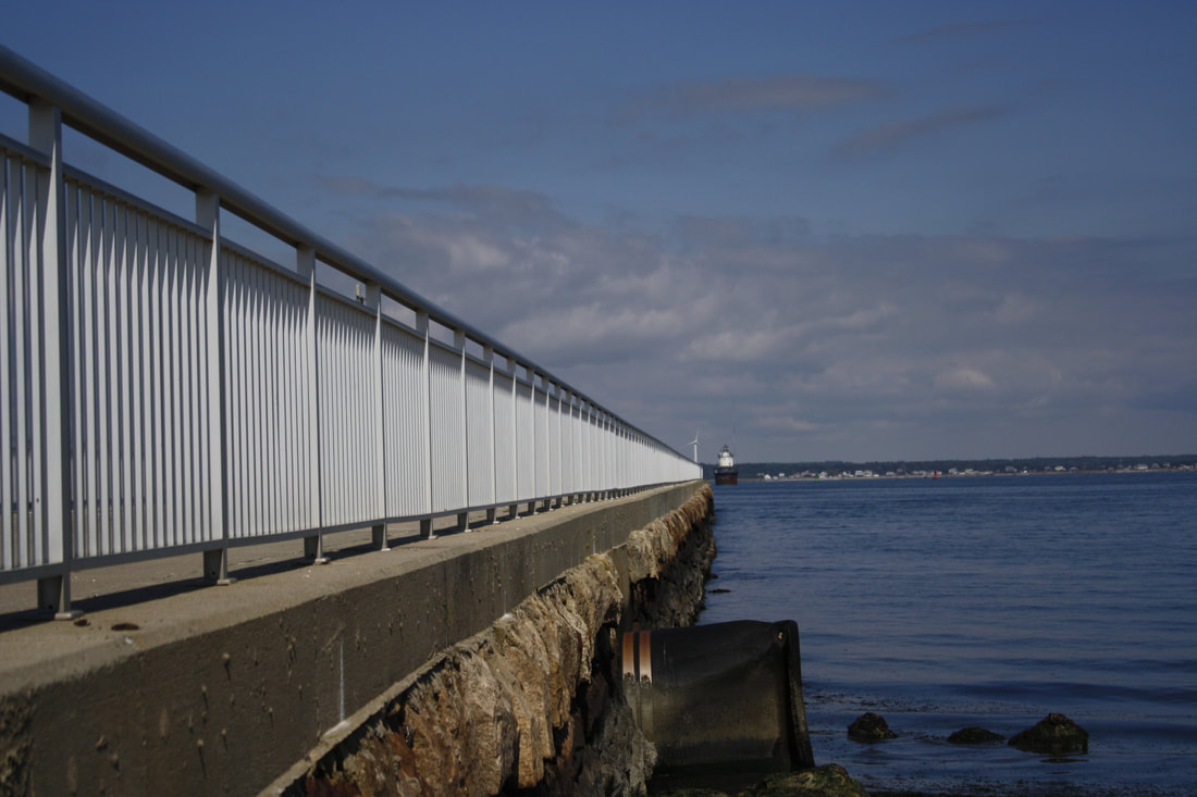
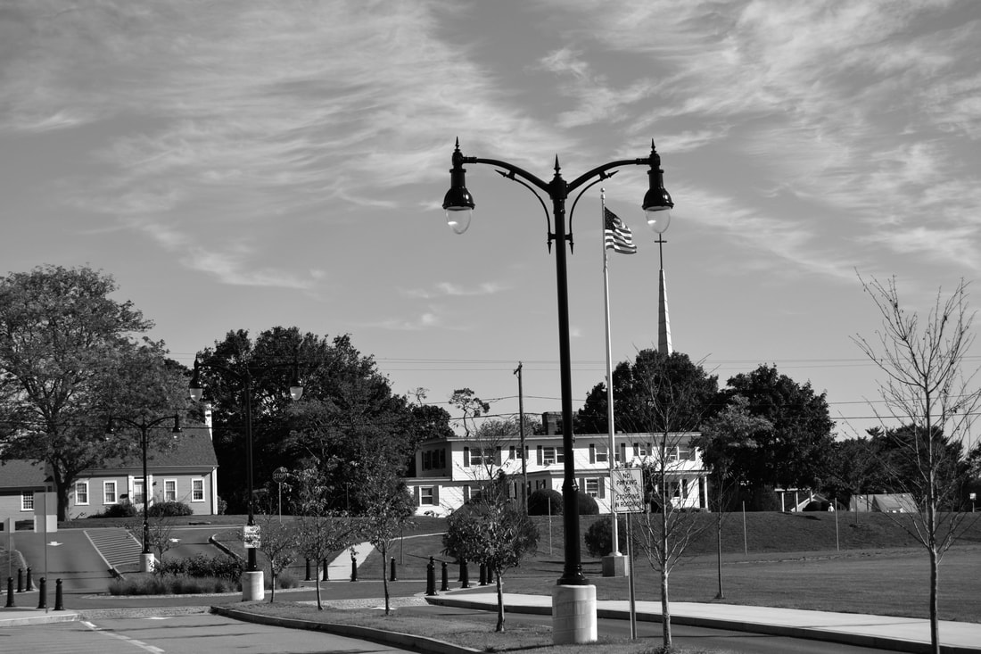
The locations that I shot at were Fort Tabor and I took pictures of the bridge and the hills. The photos were mostly of the bridge and some of the Fort itself. I took the photo of the bridge with the lights straight (picture 4) on but I took some from below. I took the photos up close but, some far away. I took most of my photos horizontal. I tried to consider the rule of thirds; however, I thought some of the railing looked better in the middle. I think this one was the most dynamic because it led your eye to the back of the photos with the lamp posts in the background as well.
In Class Photos 9/29/17
Dodge and Burn Practice 10/16/17


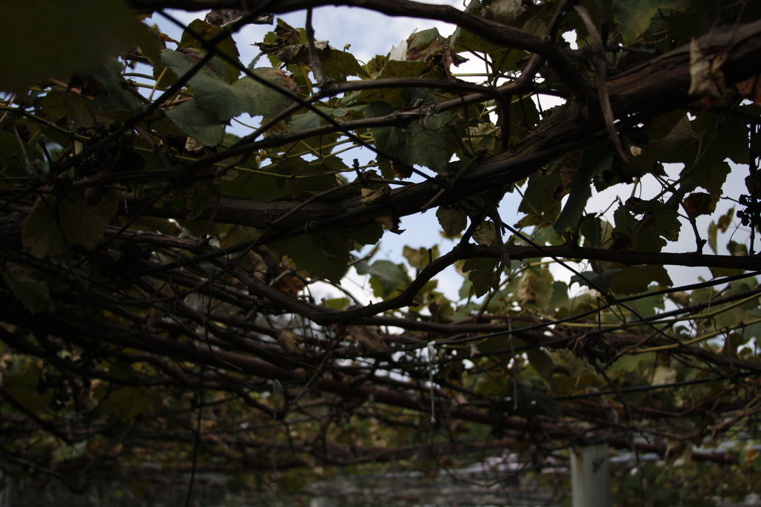
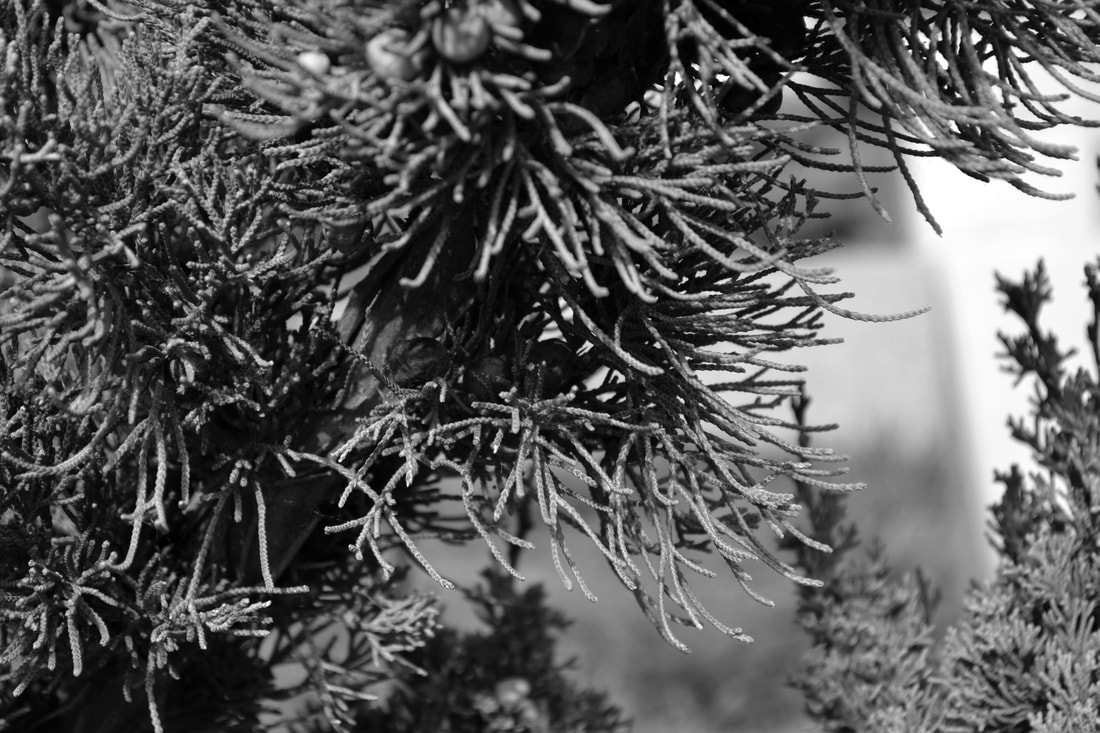
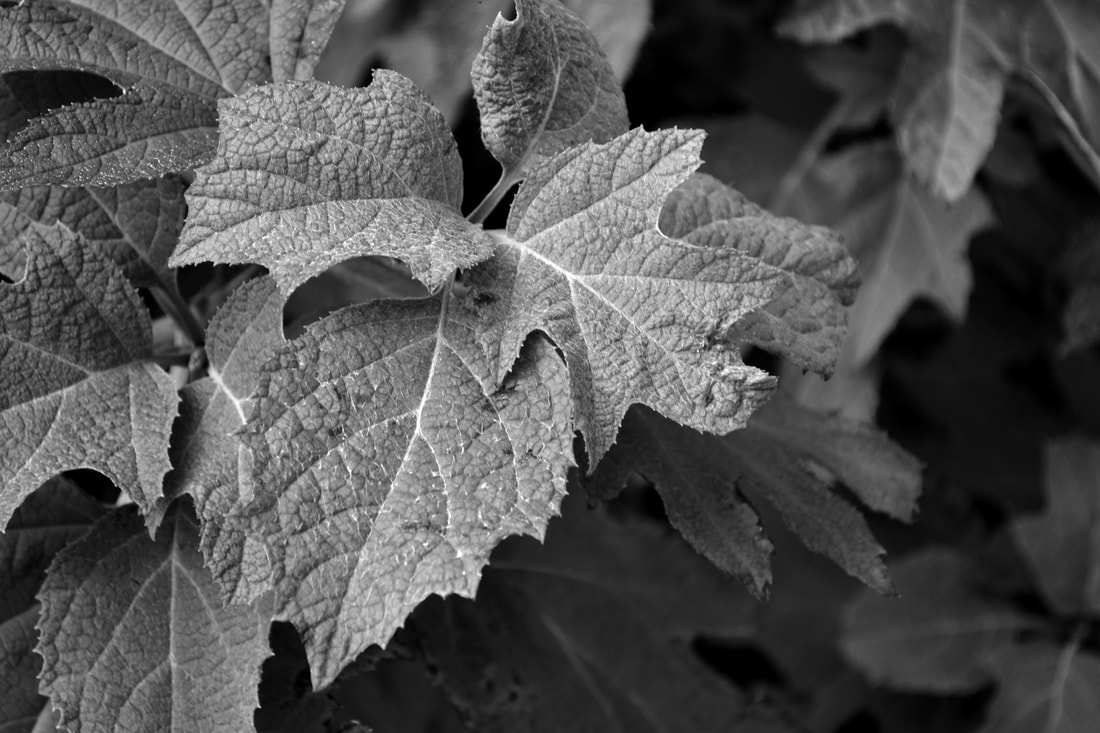
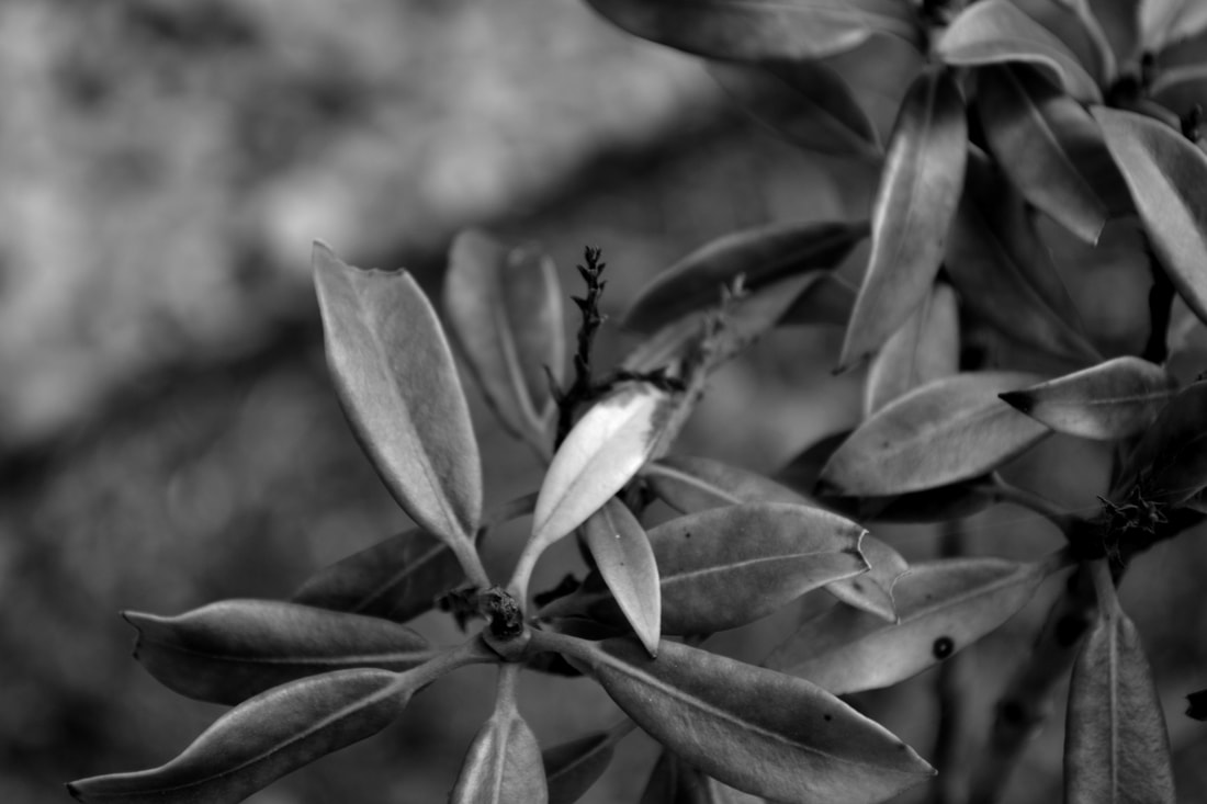
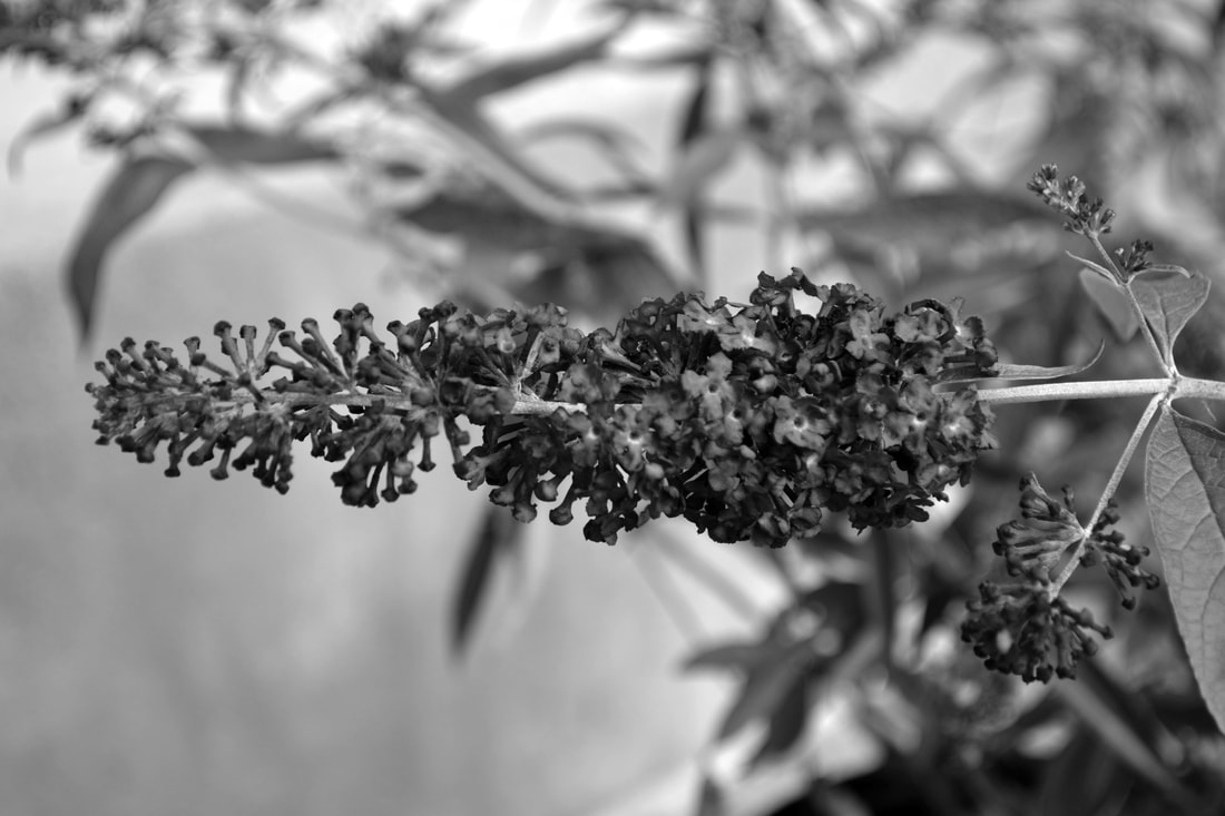
Pattern and Texture
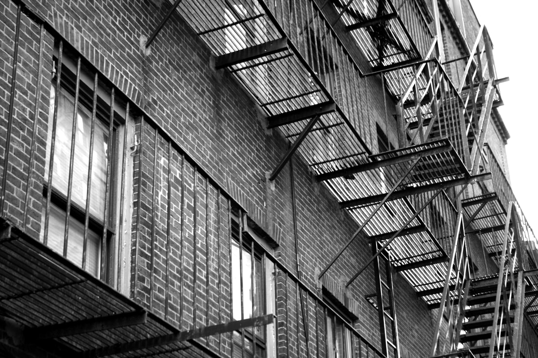


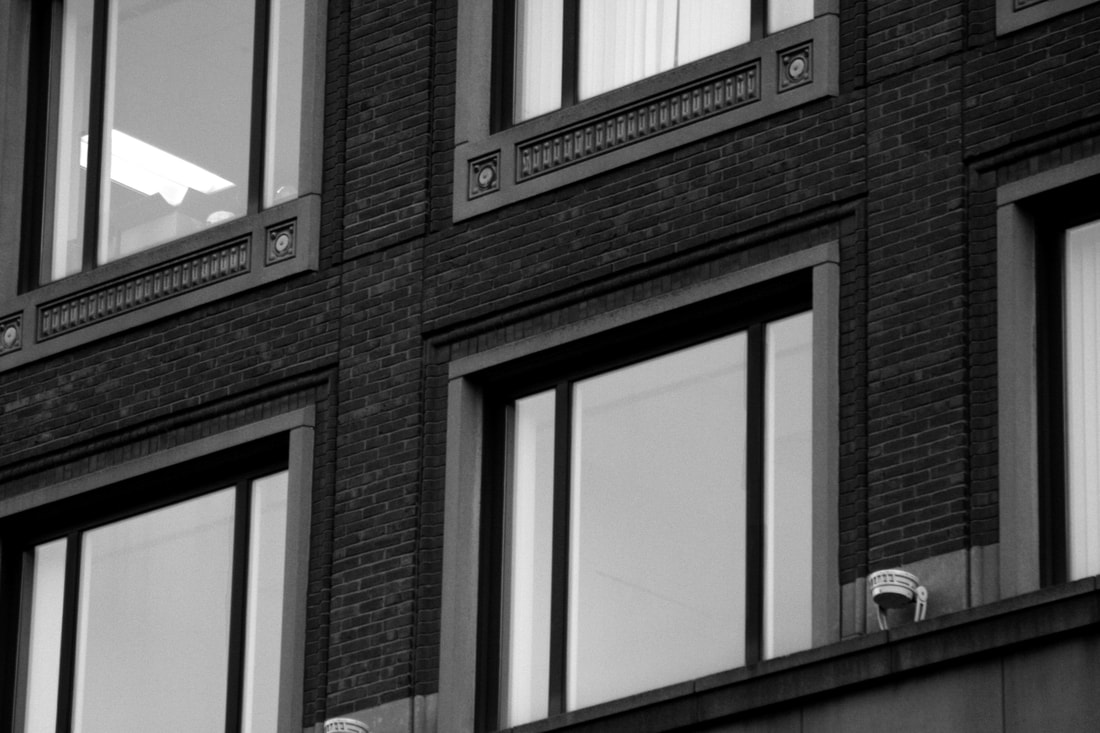
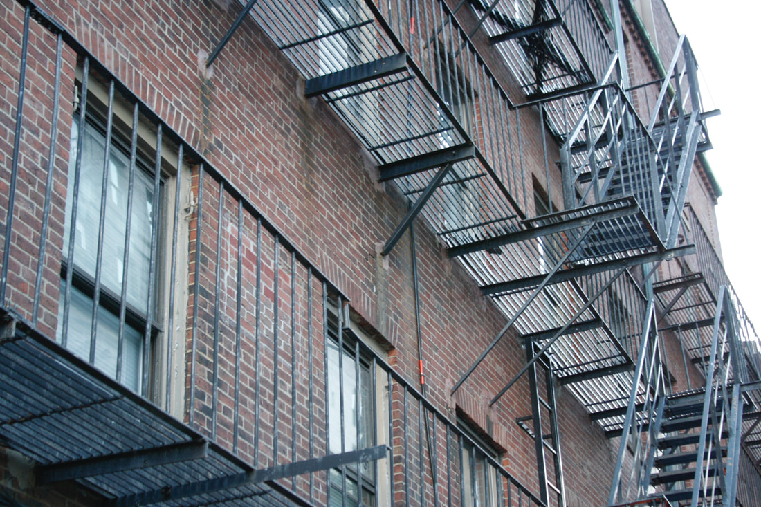


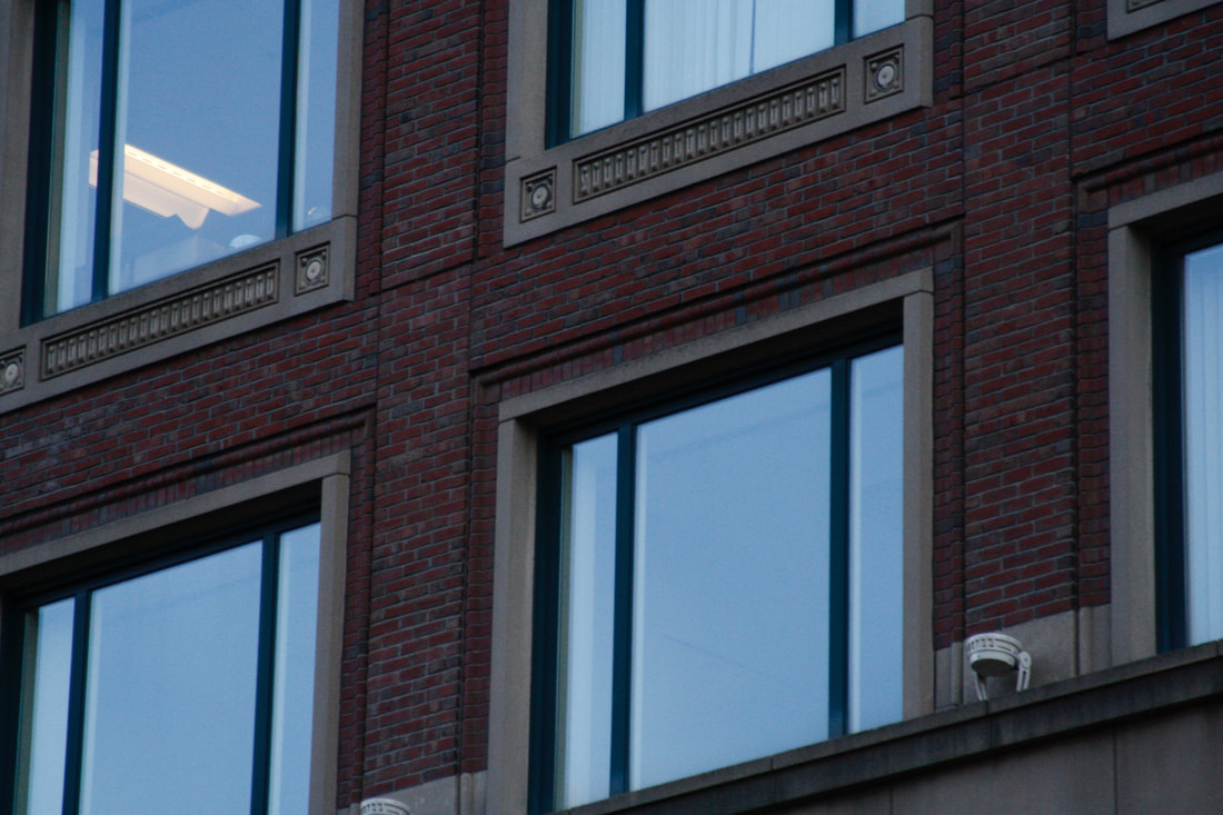
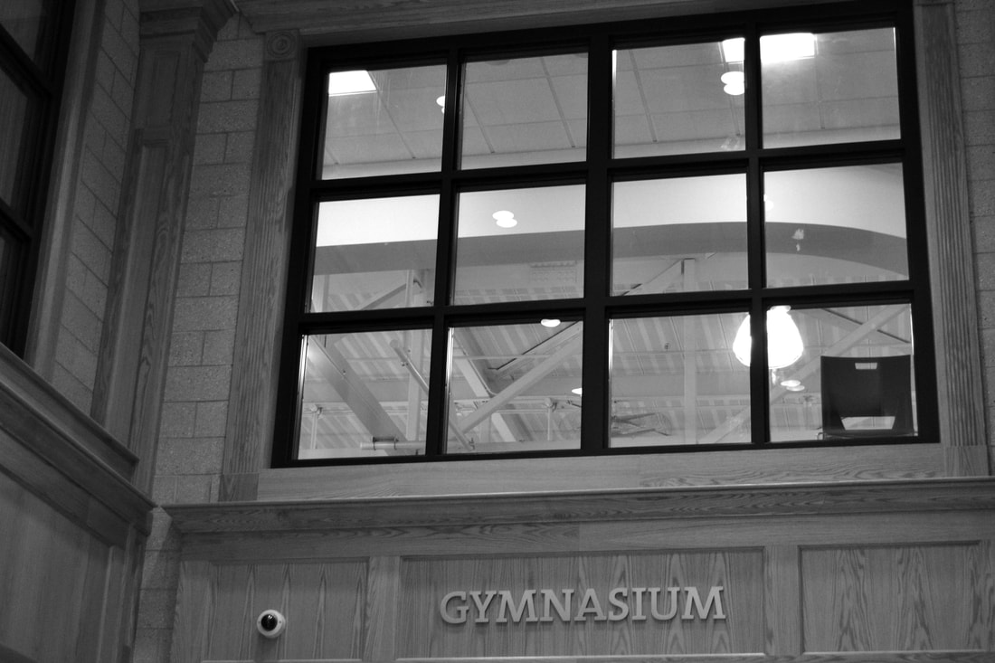
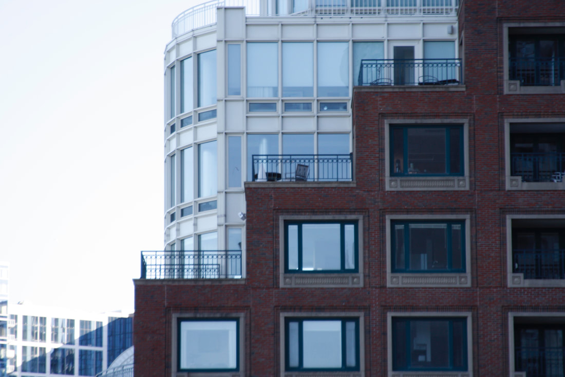
My best shot was the picture of the flower. I took the image from close up. When i took the picture I was straight on but from a little below. The photograph is horizontal. I kind of followed the rule of thirds but, the flower was kind of in the center of the photo. The photo is an example of patter because the leaves repeat in a circle. The image that may be overexposed might be the one with the side of the building that looks like a staircase. The areas that are too bright are the building behind the one in front. The image that might be underexposed is the one of the windows. The places that are too dark are the parts of the building where it meets the window, The image that might be properly exposed is the one with the side of the building with the fire escapes. It might be properly exposed because it has a lot of white and dark tones.
In Class Photos 10/5/17
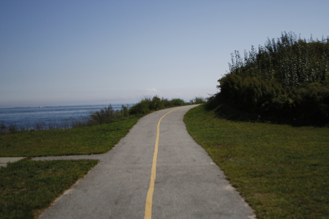
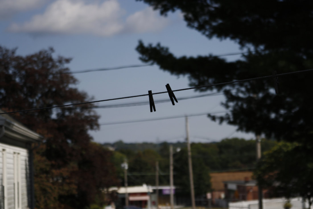
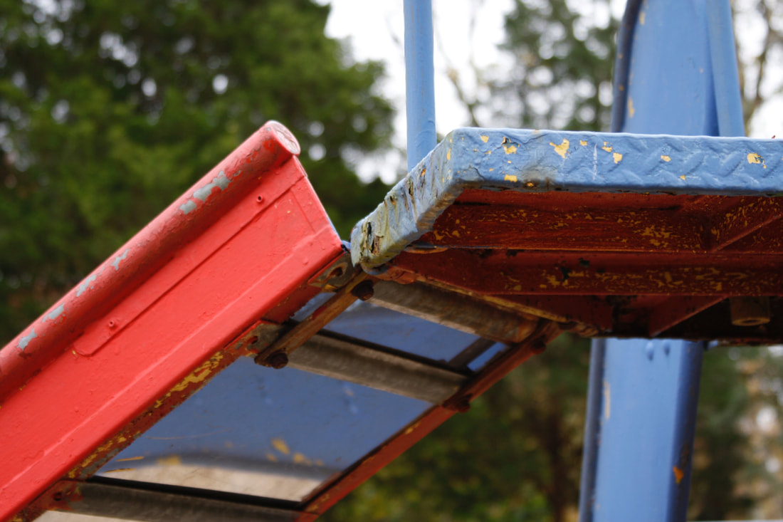
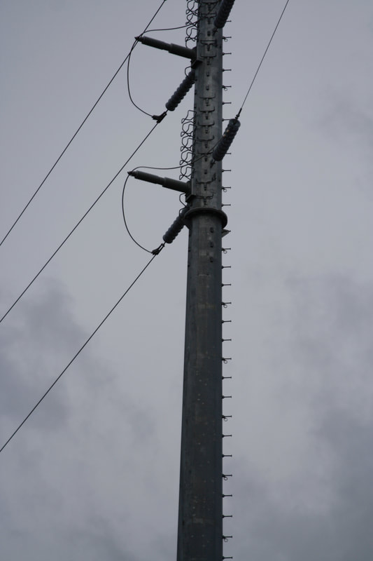
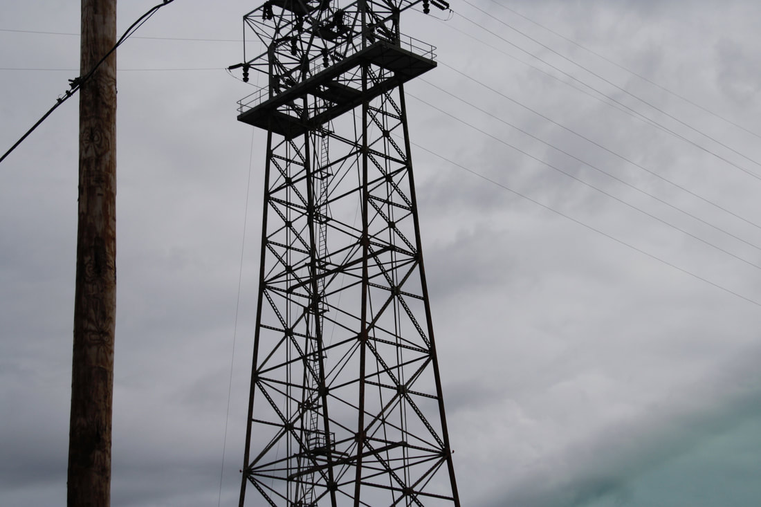
Power Lines and Playgrounds
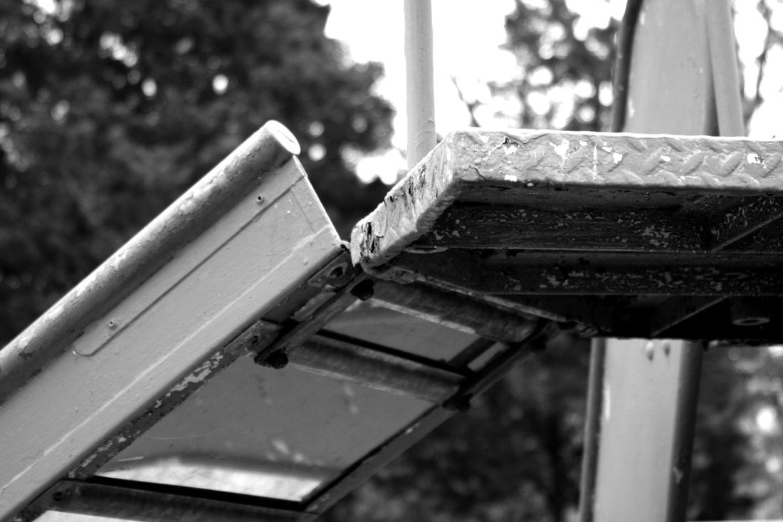
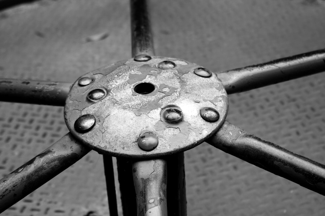
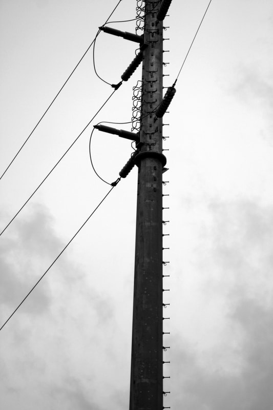
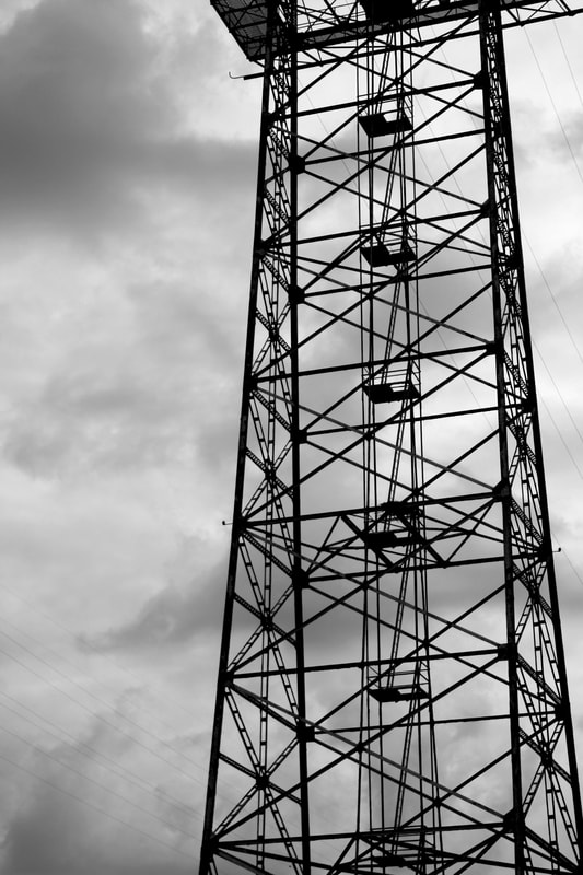
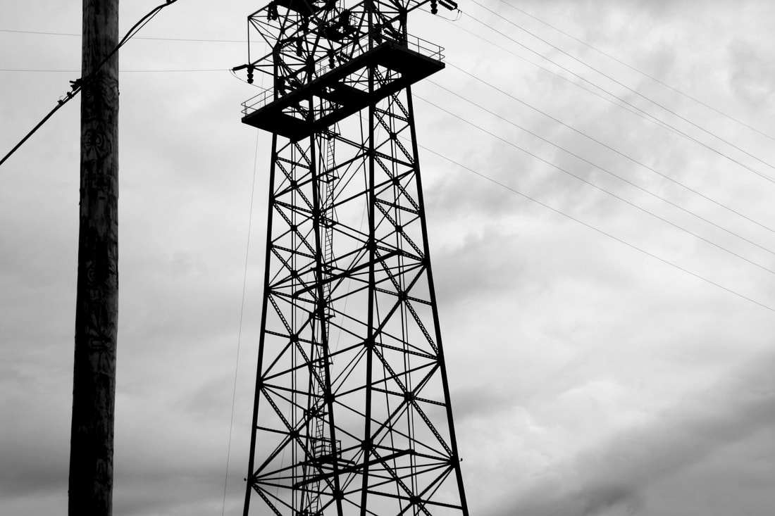
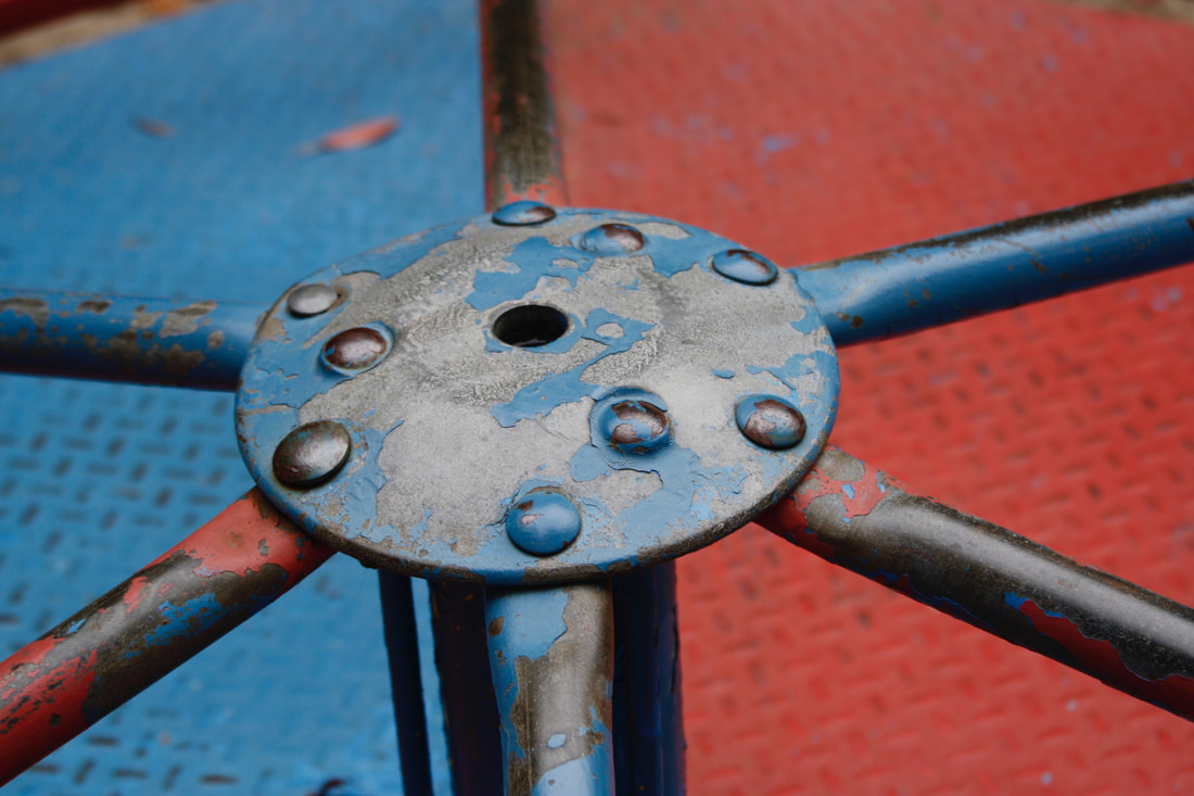
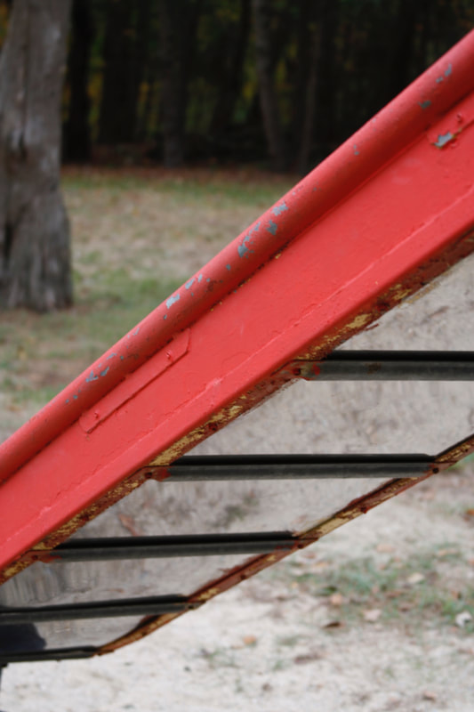
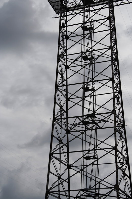
The best photo that uses the rule of thirds is the fifth one because the tower isn't in the center of the photo, it's on the side of the image. The best photo that uses distance or point of view is the first one because I took it from below but also up close. I feel that the one that best fits for best negative space is the fifth one because it has a lot of dark lines but also spaces between the lines. The photo that best brings the viewers eyes sound is the second one because it has a circle that brings the viewers eyes around the image. I think the image that best fits the assignment is the first one because it has the slide in it which represents the playground part. It showcases that i have learned about composition of photos and how to create interesting ones. I think the first image best represents the best exposure because their is dark grays and blacks and also light grays and whites.
